Some GDP and health trends from Gapminder
June 22, 20111 minsA friend alerted me to Gapminder.org a while ago and today I finally sampled some of their amazing datasets via their nifty Trendalyzer. If you haven’t heard of Gapminder, their mission statement should catch your attention:
Fighting the most devastating myths by building a fact-based world view that everyone understands.
Their website describes Gapminder as a non-profit venture – a modern “museum†on the Internet – promoting sustainable global development and achievement of the United Nations Millennium Development Goals. Expressed more tersely, Gapminder is a “fact tank” (think “think tanks”).
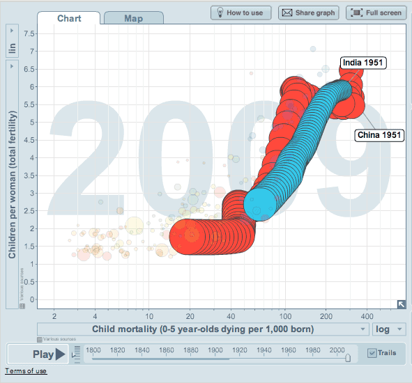
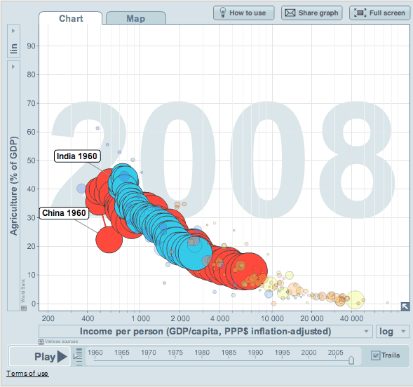
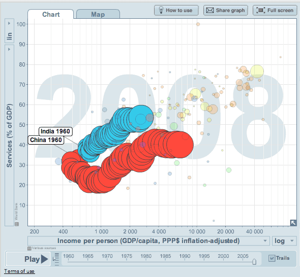
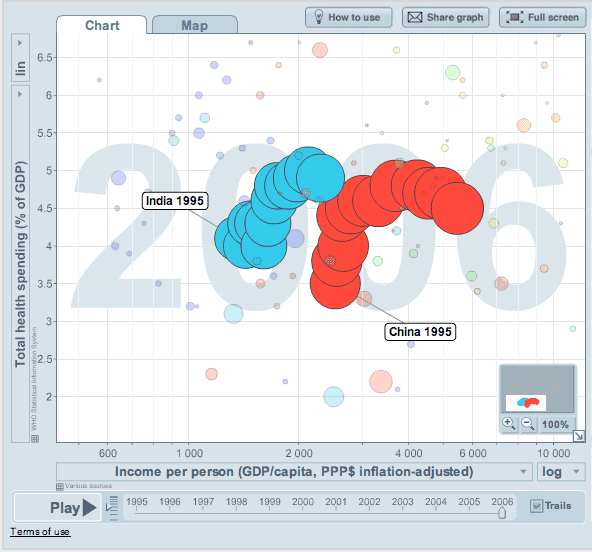
Anyway, I picked four datasets relevant to this blog with a sufficiently long time series to make them interesting. The interactive graphics on the Gapminder Trendalyzer are fun to view so I’ve linked the original Gapminder interactive graph from the screenshots. Since it’s more fun to compare trends with a similarly large country (in terms of population), I’m using China for that purpose.
- India’s child mortality rate dropped from 26% (1951) to 6.6% (2009). For China it dropped from 31% (1951) to 1.9% (2009).


